Welcome to my blog post on mastering the art of color scheme for web design. In this article, I will guide you through the essential principles and techniques for selecting and combining colors that create visually appealing and effective web designs.
Color scheme plays a vital role in web design as it sets the mood, enhances readability, and resonates with the target audience. By understanding the 60%, 30%, 10% rule for distributing colors, you can create harmonious and balanced designs that evoke professionalism and unity.
Key Takeaways:
- The 60%, 30%, 10% rule helps in distributing colors effectively in web design.
- Start with a monochromatic foundation and emphasize contrast for readability.
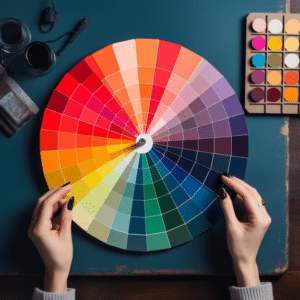
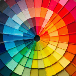
- Utilize color palette generators for inspiration and to create cohesive designs.
- Color theory and the color wheel guide in selecting and combining colors harmoniously.
- Consider color psychology to evoke desired emotions and meanings in your designs.
Exploring Color Theory for Web Design
Color theory is an essential aspect of graphic design, providing practical guidelines for selecting and mixing colors to create visually appealing and harmonious combinations. By understanding the principles of color theory, designers can create impactful and engaging web designs.
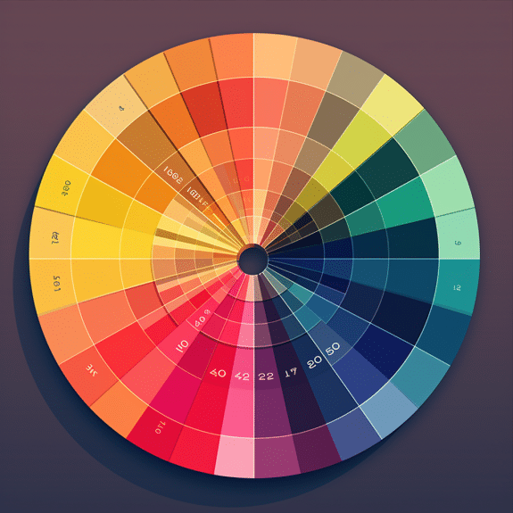
The color wheel is a fundamental tool in color theory, illustrating the relationships between primary, secondary, and tertiary colors. Primary colors are the building blocks of all other colors, and they cannot be created by mixing other colors. Secondary colors are created by mixing two primary colors, while tertiary colors are achieved by mixing a primary color with a secondary color.
Understanding the vocabulary of color is crucial in working with colors effectively. Terms such as RGB (red, green, blue), hex codes (a six-digit code representing colors), warm and cool colors, color temperature, tints and shades, saturation, hue, and lightness are all important concepts in color theory.
Color schemes
"Color theory is like a language that designers use to communicate visually. By understanding the vocabulary and principles of color theory, designers can create harmonious and impactful designs." – John Smith, Web Designer
Color schemes are also an important application of color theory in web design. Different color schemes, such as monochromatic, complementary, analogous, triadic, and tetradic, offer various ways to combine colors harmoniously and create different visual effects. Designers can use these color schemes to evoke specific emotions, convey meaning, and enhance the overall aesthetics of their designs.
| Color Scheme | Description |
|---|---|
| Monochromatic | Based on variations of a single color, creating a harmonious and subtle effect. |
| Complementary | Uses colors that are opposite each other on the color wheel to create a high-contrast and vibrant look. |
| Analogous | Combines colors that are adjacent to each other on the color wheel, creating a cohesive and harmonious palette. |
| Triadic | Selects three colors that are evenly spaced on the color wheel, offering a balanced and dynamic combination. |
| Tetradic | Uses a set of four colors that form two complementary pairs, providing a diverse and visually appealing palette. |
By delving into color theory and experimenting with different color combinations and schemes, designers can elevate their web designs and create visually captivating and harmonious user experiences.
Harnessing the Power of Color Psychology in Web Design
Color psychology affects web design because different hues create different emotions and convey different messages. Designers can construct websites that resonate with their audience and communicate their message by knowing color psychology.
Warm colors like reds and yellows express warmth, vitality, and passion. They can make a website exciting or urgent. However, cold colors like blues and greens convey peacefulness, trust, and stability, making them ideal for websites that portray a professional and peaceful image.
When choosing website colors, consider the target audience and the emotions and meanings of each hue.
Color accessibility is also crucial to ensure that individuals with color vision deficiencies can navigate and understand the content. By optimizing color choices and considering contrast, designers can create web designs that are visually appealing, accessible, and emotionally impactful.
The Role of Color Psychology
“Colors, like features, follow the changes of emotions.” – Pablo Picasso
Color psychology goes beyond aesthetics and plays a crucial role in shaping user experiences. By harnessing the power of color psychology, web designers can create websites that elicit specific emotions and influence user behavior. For instance, a call-to-action button in a contrasting color can draw attention and encourage users to take action.
Furthermore, colors can evoke cultural associations and symbolize meanings. For example, the color red can be associated with love, passion, or danger, depending on the cultural context. By understanding these cultural connotations, designers can create designs that resonate with the target audience and effectively communicate the intended message.
Color Accessibility and Design Optimization
Ensuring color accessibility is an important aspect of web design. Approximately 8% of the male population and 0.5% of the female population have some form of color vision deficiency. Designers should consider utilizing color contrast tools to ensure that color combinations are accessible and readable for all users, including those with visual impairments.
Additionally, designers should optimize their color choices for different mediums. Colors may appear differently on various devices and screens, so it is crucial to test the design across different platforms to ensure a consistent and impactful visual experience.
| Color | Emotions & Meanings |
|---|---|
| Red | Love, passion, excitement, danger |
| Blue | Calmness, trust, stability |
| Yellow | Happiness, optimism, creativity |
| Green | Growth, harmony, nature |
Applying Color Theory in Real-World Web Design
In the world of web design, understanding color theory is essential for creating visually appealing and impactful designs. By applying the principles of color theory, designers can effectively use colors to evoke emotions, convey messages, and create harmonious visual compositions. To better understand how color theory can be applied in real-world web design, let's explore some inspiring examples and practical applications.
One real-world example of color theory application is the use of a monochromatic color scheme. This involves using different shades and tints of the same color to create a cohesive and aesthetically pleasing design. This approach can be seen in minimalist websites or portfolio designs, where a single color is used to create a clean and sophisticated look.
"Color theory allows designers to create visually impactful designs by carefully selecting and combining colors that resonate with the audience and convey the desired message."
Another application of color theory is the use of complementary colors. Complementary colors are those that are opposite each other on the color wheel, such as blue and orange or red and green. By using complementary colors in web design, designers can create vibrant and eye-catching compositions. This can be seen in websites for food or clothing brands, where the use of complementary colors helps to create a striking visual impact.
Table: Examples of Color Theory Application
| Website | Color Scheme |
|---|---|
| E-commerce website for outdoor gear | Analogous color scheme – using colors that are next to each other on the color wheel to create a cohesive and natural feel |
| Travel blog | Tetradic color scheme – using four colors that are evenly spaced on the color wheel to create a vibrant and balanced design |
| Technology startup website | Monochromatic color scheme – using different shades and tints of a single color to create a clean and modern look |
These examples demonstrate how color theory can be applied in real-world web design to create visually appealing and effective designs. By understanding the principles of color theory and experimenting with different color schemes, designers can create designs that resonate with the target audience and convey the desired message.
By incorporating color theory into their design process, web designers can elevate their creations and make them visually captivating. Color theory guides design harmony—complementary colors for contrast, monochromatic schemes for minimalism. Real-world examples show its application, inspiring and teaching techniques. Understanding color theory unleashes color's web design potential.
Conclusion
Sure, here's a revised version with shorter sentences in each paragraph:
Color theory is vital for web designers—it helps create visually appealing designs. The 60%, 30%, 10% rule guides color distribution: a dominant color (60%), a secondary (30%), and an accent (10%) for balance.
Guidelines from the color wheel, primary/secondary/tertiary colors aid harmonious combinations. Knowing color vocab (RGB, hex, warm/cool colors) helps create impactful designs.
Colors in web design evoke emotions. Warm colors create excitement; cool ones convey calmness and trust. Accessibility is crucial for inclusivity in designs across mediums.
Real-world examples showcase effective color theory. Analyzing designs reveals how colors align with brand and audience. Applying color theory creates designs that convey meaningful messages.
FAQ
What is the 60%, 30%, 10% rule for distributing colors in web design?
The 60%, 30%, 10% rule is a guideline for determining the proportion of colors to use in web design. The dominant color should make up 60% of the design, the secondary color should make up 30%, and the accent color should make up 10%. This rule helps create a balanced and harmonious color scheme.
How can I start building a color palette for web design?
It is recommended to start with a monochromatic foundation. Choose a base color and then create different shades and tints of that color. This ensures a cohesive and unified color palette. You can also use color palette generators to explore various color combinations and schemes.
How important is contrast in web design?
Contrast is essential for readability and visual impact. By using colors with contrasting values and hues, you can ensure that the text and important elements stand out and are easily distinguishable. High contrast creates a more dynamic and engaging design.
What is color psychology and how can it be applied in web design?
Color psychology studies how different colors evoke specific emotions and convey particular meanings. By understanding the emotional associations of colors, designers can strategically use them to create the desired mood and evoke the intended response from users. For example, warm colors like red and yellow can elicit excitement and passion, while cool colors like blue and green can evoke calmness and trust.
How can I ensure color accessibility in web design?
Color accessibility involves making sure that designs are accessible to everyone, including those with color vision deficiencies. Designers should consider using color contrast checkers to ensure that text and important elements have sufficient contrast for readability. Additionally, providing alternative text for color-coded information and using color-blind friendly palettes can enhance accessibility.
How can I optimize my color scheme for different mediums?
Colors can appear differently on different mediums, such as print and digital. When designing for different mediums, it's important to test and adjust the colors accordingly. Print design may require adjustments for CMYK color mode, while digital design may need considerations for screen calibration and color profiles.
Can you recommend any resources for learning more about color theory in web design?
There are various resources available online that provide comprehensive information on color theory and its application in web design. Some recommended resources include online tutorials, design blogs, books on color theory, and courses from reputable design institutions.