Elevating Web Design: Parallax Scrolling Unleashed and Parallax scrolling websites are like the cool kids in the digital neighborhood, grabbing attention with their fancy 3D trickery on a flat 2D screen. It’s a nifty move where designers play with different layers of images to make it seem like there’s depth and perspective, giving us a “wow” moment.
Lately, lots of websites are jumping on the parallax scrolling bandwagon. It’s like a secret sauce for websites, making them more interesting and fun for people to click around.
But here’s the deal: when you’re messing with parallax scrolling, it’s smart to keep things easy and make sure your website runs smoothly for everyone. Mix in parallax with other design stuff, and keep testing and fixing things up. That way, you end up with a website that’s not just cool but also works like a charm.
Table of Contents
ToggleKey Takeaways:
- Parallax scrolling makes a regular 2D website look super cool with a fancy 3D effect.
- It jazzes things up and makes websites more fun and interesting to play around with.
- To make it work well, keep it simple, make it run smoothly, and ensure everyone can use it easily.
- Mixing parallax scrolling with other design tricks can make your website even more awesome.
- Always test things out and keep making your parallax site better and better.
Impressive Benefits of Parallax Scrolling
Parallax scrolling isn’t just cool to look at – it’s also great for making websites more interesting. When you scroll down a page with parallax, it seems like different parts are moving at different speeds, creating a kind of 3D effect. This not only looks cool but also makes the whole website experience better. It’s like a little trick for your eyes that makes the site more fun to explore.
One big advantage of parallax scrolling is how it shows off the size and details of things. When images on different layers move at different speeds, it’s a clever way to draw attention to products or important info. It’s like saying, “Hey, check this out!” in a way that’s hard to ignore.
Besides just looking good, parallax scrolling shakes things up compared to regular websites. Adding movement and depth makes the site more exciting and different from the usual. It’s not just about looking fancy – it’s about making your website stand out. Whether it’s telling a story or just showing content in a cool way, parallax scrolling is like giving your users a little extra something that they’ll remember.
“Parallax scrolling adds a fresh and exciting feel to websites across all industries.”
Parallax Scrolling
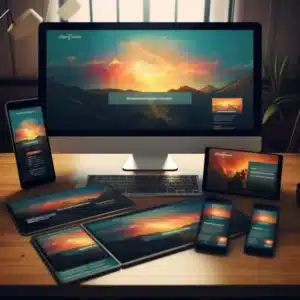
Sure thing! Parallax scrolling is like the secret sauce for making websites look cool and work great on any device. Nowadays, lots of folks are using their phones to surf the web, so it’s crucial that websites can flex and look awesome on both big computer screens and tiny phone displays.
In a nutshell, parallax scrolling is a game-changer for website design. It not only adds a wow factor to the visuals but also amps up how much people enjoy using the site. It’s a win-win for designers and users alike. When a website rocks parallax scrolling, it stands out, grabs your attention, and leaves a lasting impression.
The History and Future of Parallax Scrolling
Over the years, parallax scrolling has come a long way from its early days in animation to becoming a handy tool in today’s web design. Even before the internet was a thing, Disney used parallax to add depth to their 2D screens, laying the groundwork for a design trick that would later become pretty popular.
As technology got better, designers and developers started using parallax scrolling on websites. They used stuff like JavaScript and other tools to make websites more interesting for users. This idea also made its way into video games, with famous games like Sonic the Hedgehog and Super Mario Bros. using parallax scrolling to make it look like the backgrounds were far away and moving.
Conclusion
Looking forward, parallax scrolling is getting ready to shape the future of how we design user experiences (UX). Its knack for adding depth, making things interactive, and telling stories makes it a really useful tool in digital design. As more experts get into using parallax scrolling, we can expect to see some amazing designs and cool ways of using it that break the limits of what we thought was possible.
If you want to use parallax scrolling, there are different website builders out there that make it easy. These platforms have easy-to-use interfaces and lots of features. They let designers make awesome parallax designs without having to be coding wizards. With the right tools and a good eye for design, anyone can let their creativity loose and make really cool parallax scrolling experiences
FAQ
What is parallax scrolling?
Parallax scrolling is a technique used in website design to create a visually stunning 3D effect on a 2D website. It involves multiple layers of images that move at varying speeds, creating an illusion of depth and perspective.
Why is parallax scrolling popular?
Parallax scrolling has become increasingly popular in recent years due to its ability to add a sense of dynamism and interactivity to a website. It makes the website more engaging and memorable to users.
What are the best practices for using parallax scrolling?
Some best practices for using parallax scrolling include keeping it simple, being careful with performance, prioritizing accessibility, mixing with other design techniques, and constantly testing and improving the designs.
What benefits does parallax scrolling offer for website design?
Parallax scrolling tricks your eyes into seeing things in 3D, creates an illusion of depth, helps showcase the size of objects, focuses the user’s attention, and adds visual appeal to websites.
How does parallax scrolling enhance user engagement?
Parallax scrolling breaks up the monotony of websites with mundane content, making them more engaging and visually appealing. It adds a fresh and exciting feel to websites across all industries.
What is the history of parallax scrolling?
Parallax scrolling has a rich history that dates back to the early days of animation. It was utilized by Disney to create a feeling of depth in 2D screens even before the internet era.
How is parallax scrolling expected to evolve in the future?
In the coming years, parallax scrolling is set to become a key player in how we design user experiences. It adds depth, interaction, and storytelling, making digital design more exciting. This technique has the power to break new ground and keep users hooked.