As a website owner, I understand the importance of mobile-friendly design in today's digital landscape. With the increasing number of people accessing the internet through their mobile devices, it's crucial to optimize your website for mobile users. Not only does it enhance their browsing experience but also boosts your website's visibility in Google rankings. In this section, I'll share some valuable mobile-friendly design tips that will help you create SEO-optimized websites that prioritize user experience.
Key Takeaways:
- Mobile-friendly design is essential for improving user experience and boosting Google rankings.
- Optimizing your website for mobile devices contributes to a seamless browsing experience.
- Creating responsive web designs ensures your website looks and functions seamlessly across different screen sizes.
- Mobile-friendly navigation and clear call-to-action buttons are necessary for user engagement.
- Optimizing images for faster loading times enhances the overall mobile user experience.
Importance of Mobile-Friendly Design
In today's digital landscape, the importance of mobile-friendly design cannot be overstated. With the shift towards mobile-first indexing by search engines, it has become imperative for websites to prioritize mobile responsiveness. This not only ensures a seamless browsing experience for mobile users but also plays a crucial role in improving user engagement and page loading speed, both of which are vital for SEO success.
Mobile-first indexing is a concept introduced by search engines like Google, where the mobile version of a website is given priority over the desktop version when determining search rankings. This means that having a mobile-friendly website is no longer optional but necessary for achieving higher visibility and organic traffic.
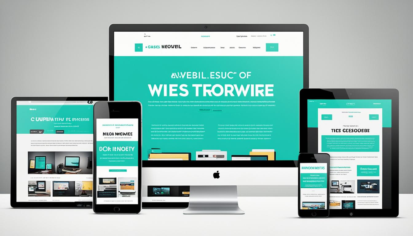
A key aspect of mobile-friendly design is responsive design. By implementing responsive design techniques, websites automatically adjust their layout and content based on the screen size and device of the user. This not only enhances the user experience but also eliminates the need for separate mobile and desktop versions of a website, making it more efficient to maintain and update.
Furthermore, optimizing page loading speed is crucial for mobile SEO. Mobile users expect fast and smooth browsing experiences, and if a website takes too long to load, they are likely to abandon it and seek alternatives. Therefore, it is essential to optimize images, minimize code, and leverage caching techniques to improve page speed and retain users' interest.
Enhancing user engagement is another vital aspect of mobile-friendly design. Mobile users tend to have shorter attention spans and consume content in shorter bursts. To keep them engaged, it is crucial to create clear and concise calls-to-action, simplify navigation, and provide interactive elements that encourage further exploration and interaction.
"Mobile-first indexing, responsive design, page loading speed, and user engagement are all interconnected aspects of mobile-friendly design. By optimizing these factors, websites can not only improve their search rankings but also provide a better browsing experience for users on mobile devices." – [Name]
In the next section, we will delve deeper into mobile-friendly design best practices and explore actionable strategies for implementing them on your website.

Mobile-Friendly Design Best Practices
Implementing responsive web design is the foundation of creating a mobile-friendly website. With the increasing variety of screen sizes, it is vital to ensure that your website looks and functions seamlessly across different devices. Responsive design automatically adjusts the layout and content based on the user's screen size, providing an optimal browsing experience whether your visitors are on a smartphone, tablet, or desktop.
One key aspect of mobile-friendly design is optimizing navigation for mobile users. Clear and concise menus that are easy to navigate are essential for keeping users engaged and allowing them to find the information they need quickly. Mobile-friendly navigation should be intuitive, with a user-friendly menu that smoothly adapts to mobile devices, providing a seamless browsing experience.
When it comes to optimizing images for mobile, keep in mind that mobile users expect fast-loading websites. Therefore, it is important to compress and resize your images without compromising quality. By doing so, you can ensure that your website loads quickly, reducing bounce rates and improving user satisfaction. Additionally, incorporating clear call-to-action buttons on your mobile website can effectively guide users towards desired actions, such as making a purchase or contacting your business.
In summary, for a website to be truly mobile-friendly, it must incorporate responsive design, efficient navigation, optimized images, and clear call-to-action elements. Applying these best practices will not only improve the user experience but also boost your website's visibility and performance in search engine rankings.
FAQ
What are some mobile-friendly design tips for optimizing my website for SEO?
Implement responsive design, optimize page loading speed, and enhance user engagement.
Why is having a mobile-friendly website important?
With the shift towards mobile-first indexing by search engines, having a mobile-friendly website is crucial for improving user experience and boosting Google rankings.
What is responsive design and why is it important for mobile-friendly design?
Responsive design automatically adjusts the layout and content based on the user's device, ensuring that the website looks and functions seamlessly across different screen sizes.
How can I optimize my navigation for mobile users?
Use clear and concise menus to make it easy for mobile users to navigate your website and keep them engaged.
How can I optimize images for faster loading times on mobile devices?
Compress the images and utilize lazy loading techniques to improve the loading speed on mobile devices.
What are some strategies for enhancing user engagement on mobile devices?
Incorporate clear call-to-action buttons and ensure that the content is engaging and easy to read on mobile devices.