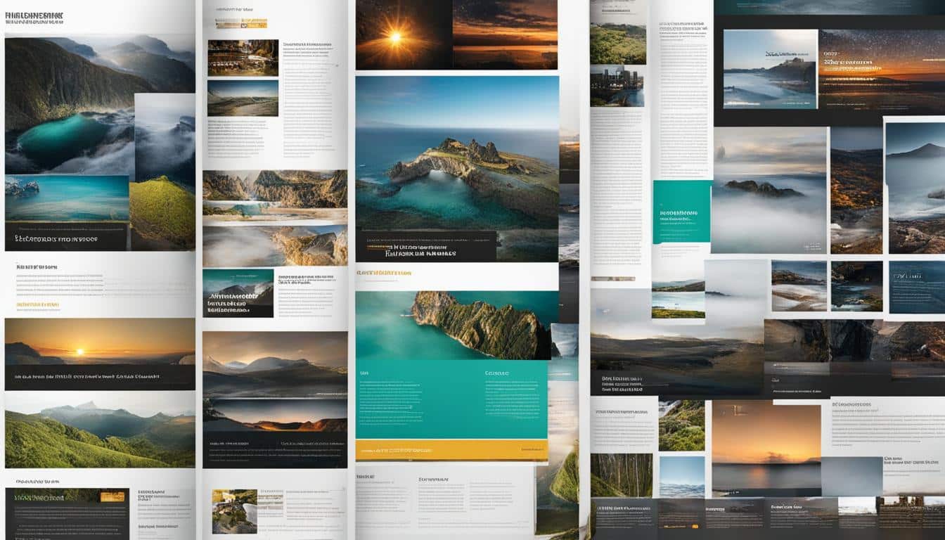
Designing a magazine-style website layout requires a combination of creativity and technical expertise. With the rising popularity of magazine-style layouts, it has become essential for designers to master this style to provide users with an exceptional reading experience.
A magazine-style layout is not just about arranging content in a visually appealing way; it involves creating a responsive design that adapts seamlessly to different devices. The layout should provide a user-friendly interface that allows readers to navigate effortlessly through the content. Additionally, visual storytelling plays a crucial role in engaging readers and conveying information effectively.
One of the key elements in designing a magazine-style layout is the grid system. The grid helps maintain consistency and balance throughout the design, ensuring that the content flows smoothly. By integrating multimedia elements such as images, videos, and interactive elements, designers can enhance the visual appeal and storytelling capabilities of the layout.
To optimize the magazine-style website layout, it is important to consider the hierarchy of content. Headlines, subheadings, and typography should be used to guide readers and ensure readability. Colors and contrast can be used strategically to create visual interest and highlight important elements.
Overall, mastering the magazine-style website layout requires a deep understanding of design principles, attention to detail, and the ability to create a harmonious and engaging reading experience. By following these guidelines, designers can create captivating magazine-style layouts that captivate readers and leave a lasting impression.
Key Takeaways:
- A magazine-style website layout requires a combination of design skills and an understanding of visual storytelling.
- Responsive design and a user-friendly interface are crucial for a magazine-style website layout.
- The grid system helps maintain consistency and balance in the layout.
- Multimedia integration enhances the visual appeal and storytelling capabilities of the layout.
- Attention to hierarchy, typography, colors, and contrast is essential for an effective magazine-style layout.
The Key Elements of Magazine Design
When it comes to magazine design, there are several key elements that contribute to the overall effectiveness of the layout. Paying attention to these elements can greatly enhance the reading experience for your audience.
Article Headlines
Article headlines play a crucial role in attracting readers' attention and enticing them to read further. They should be impactful and meaningful, giving readers a glimpse into the content of the article. A well-crafted headline can pique curiosity and make readers want to explore more.
Preliminary Paragraph
The preliminary paragraph, also known as the kicker or stand-first, is the introductory paragraph that sets the tone for the rest of the article. This paragraph should provide a concise summary of the article's content and engage readers from the very beginning. It serves as a hook, capturing the readers' interest and encouraging them to continue reading.
Body Text, Bylines, and Sub-headings
The body text is the main part of the article and should be designed for readability and consistency. It should be easy to read, with an appropriate font size and line spacing. Bylines, which credit the author of the article, and sub-headings help organize the content and make it more scannable for readers. Sub-headings break up the text and provide a clear structure, while bylines add a personal touch and give credit to the author.
Pull Quotes, Image Captions, and Running Headings
Pull quotes are attention-grabbing excerpts from the article that are placed prominently within the layout. They highlight key points or interesting quotes to draw the reader's attention. Image captions provide context for the images used in the magazine, enhancing the visual storytelling aspect. Running headings, which appear at the top of each page or spread, help readers navigate through the magazine and provide a cohesive visual element.
Folio and Panel
The folio, or page number, is an important navigational element in a magazine layout. It helps readers keep track of their progress and locate specific articles or sections. Panels, also known as box copies, are strategically placed in the layout to showcase important facts or information. They help break up the text and provide visual interest.
| Element | Description |
|---|---|
| Article Headlines | Attract readers' attention and give a glimpse into the article's content |
| Preliminary Paragraph | Introduce the article's content and engage readers from the beginning |
| Body Text, Bylines, and Sub-headings | Ensure readability, provide structure, and credit the author |
| Pull Quotes, Image Captions, and Running Headings | Highlight key points, provide context for images, and aid navigation |
| Folio | Help readers navigate through the magazine and locate specific articles |
| Panel | Showcase important facts or information and add visual interest |
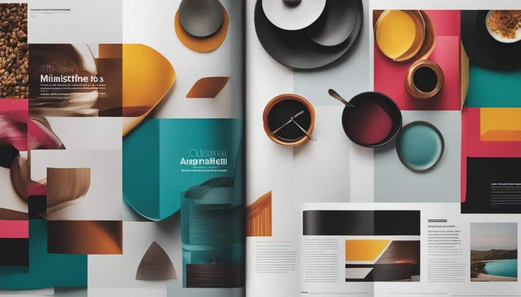
Understanding and incorporating these key elements into your magazine design can greatly enhance the overall reading experience. By carefully considering each element and finding the right balance, you can create a visually appealing and engaging magazine layout.
Tips for Designing Effective Magazine Layouts
When it comes to designing effective magazine layouts, careful planning is key. Before diving into the design process, take the time to plan out the content that will be included in the magazine. Work closely with the editorial team to understand their goals and objectives for the publication.
One way to streamline your efforts is by designing master pages. These are pre-designed templates that can be applied to multiple pages, saving you time and ensuring consistency throughout the layout. By establishing a consistent structure for your pages, you can focus on the finer details and make sure every element is in its rightful place.
Experimenting with colors can bring your magazine layout to life. Try using vibrant hues to grab readers' attention or opt for a more subdued palette to create a sense of elegance. Introducing contrast in your design can also make a big impact. Play around with contrasting fonts, colors, and images to create visual interest and guide readers through the layout.
Incorporating multimedia elements into your magazine layout can enhance the reading experience and captivate your audience. Consider including videos, image galleries, or interactive elements to engage readers and bring your content to life. Just be sure to optimize these multimedia elements for both print and digital versions of your magazine.
Lastly, before finalizing your design, take the time to review and refine your layout. Make sure all the elements are in harmony and the overall design is balanced. Pay close attention to typography, spacing, and alignment to ensure readability. Step back and view your design from the perspective of a reader to ensure it delivers a seamless and enjoyable reading experience.
FAQ
What are the key elements of magazine design?
The key elements of magazine design include article headlines, preliminary paragraphs, body text, bylines, sub-headings, pull quotes, image captions, running headings, folios, and panels.
How can I design an effective magazine layout?
To design an effective magazine layout, it is important to plan for designing, streamline your efforts, experiment with colors, introduce contrast, use multimedia, and review your design.
What is the process of designing a magazine layout?
The process of designing a magazine layout involves careful planning, understanding the content, considering colors and multimedia elements, paying attention to content hierarchy and typography, and aligning all the elements in a visually appealing way.
How can a magazine-style website layout enhance the reading experience?
Magazine-style website layouts are highly popular among users and can greatly enhance the reading experience. By designing layouts that are visually appealing and user-friendly, designers can improve the overall reading experience for users.
What is visual storytelling?
Visual storytelling is the art of using images, colors, and other visual elements to convey a narrative or message. In magazine design, visual storytelling plays a crucial role in engaging readers and enhancing the reading experience.
Why is it important to review the design of a magazine layout?
Reviewing the design of a magazine layout is important to ensure that all the elements are in harmony, the layout is balanced, and the design achieves its intended goals. It helps identify any areas that need improvement and ensures the final layout meets the desired outcome.
